Multi-Step Registration Flow
UX case study focused on improving a multi-step registration and onboarding flow to reduce user friction.
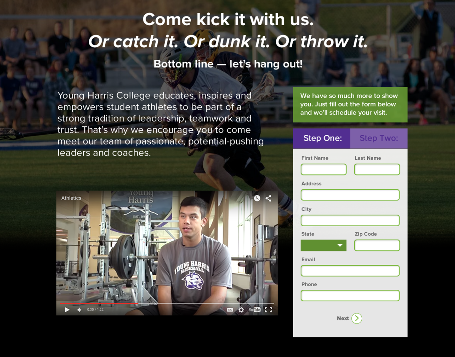
Project Information
- Category :UX Design
- Project Type :Admissions Landing Page
- Platform :Web
- Role :UX & Front-End Designer
- Focus :Registration Flow Optimization
- Year :2017 (shipped; the live page has since evolved)
The Problem
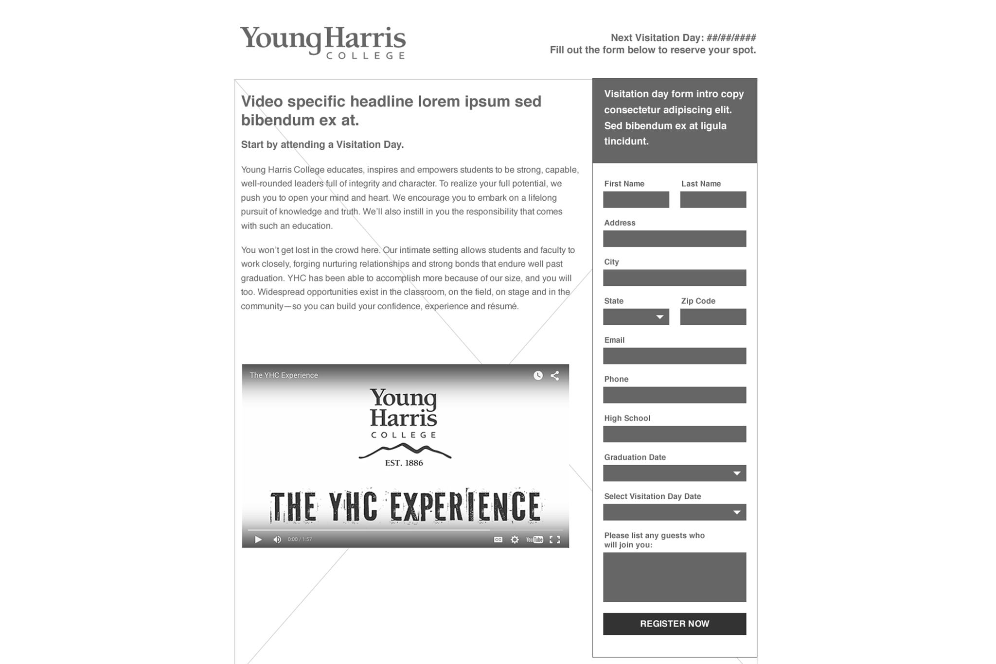
Prospective students and their families came to this page for one reason: to register for a campus visit — a high-intent moment in the admissions funnel. But the form asked for everything at once, in a single dense column beside a video that stretched the layout long. On a phone, registering meant scrolling past a wall of fields before the submit button ever appeared. The page functioned, but it asked for full commitment before giving the user any sense of progress.
Before / After
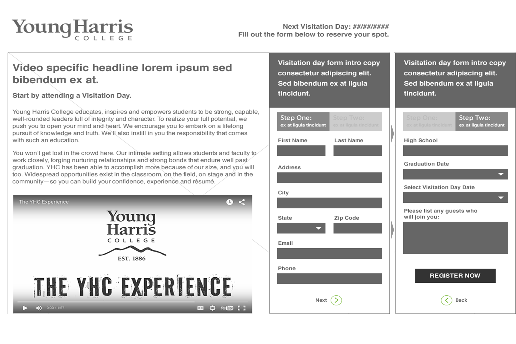
From one long form to two guided steps.
Key Decisions
1. Split the form into two steps
- Problem: a single long form mixes quick contact fields with visit details that take more thought, making the whole thing feel heavier than it is and pushing the submit button far down the page on mobile.
- Decision: split on the natural seam — contact and location info in step one, visit logistics (high school, graduation date, visit date, guests) in step two — so the form opens with the fast, low-effort half.
- Tradeoff: a second step adds a click and a potential drop-off point. I judged that front-loading the easy fields to build momentum was worth more than keeping everything on one screen.
2. Added a visible progress indicator
- Problem: multi-step flows can feel ambiguous — users don't know how much is left.
- Decision: a simple step indicator showing position and total.
- Tradeoff: it adds UI to an already busy page, but the orientation it gives is worth the visual weight.
3. Added a back option and aligned CTAs to each step
- Problem: splitting a form risks trapping users who want to review or fix an earlier entry.
- Decision: a back control plus a CTA scoped to each step (advance, then register).
- Tradeoff: more controls on screen, but error correction becomes far less disruptive.
Reflection
This was my first UX-focused project, and the constraint that shaped it was real production: it had to ship and serve actual applicants. The two-step structure tightened the layout and removed the mobile scrolling problem. If I were measuring it today, I'd track step-one-to-step-two progression and where people drop, then test whether the field grouping in step one is the right cut. The pattern was reusable enough that it could anchor other admissions forms.
Outcome
The two-step structure shortened the page, removed the mobile scrolling problem, and held together more cleanly across screen sizes — and it shipped to real applicants in the 2017 admissions cycle.